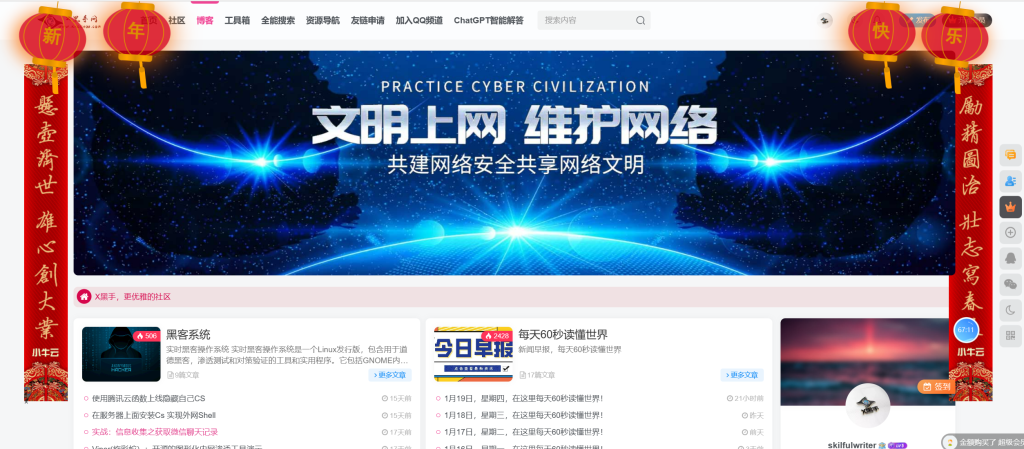
用代码给你的网站顶部添加灯笼

马上快过年了 我也不想被人捷足先登呀
放一段代码用来装饰你的Blog或者个人小站点
这样才有喜庆劲儿呢
博客:后台设置自定义输出head 头部的HTML代码 粘贴代码
单页引导页:找到<head> 在前面粘贴代码就好了
<!-- 灯笼代码 -->
<meta charset="utf-8">
<div class="deng-box2">
    <div class="deng">
        <div class="xian">
        </div>
        <div class="deng-a">
            <div class="deng-b">
                <div class="deng-t">年</div>
            </div>
        </div>
        <div class="shui shui-a">
            <div class="shui-c">
            </div>
            <div class="shui-b"></div>
        </div>
    </div>
</div>
<div class="deng-box3">
    <div class="deng">
        <div class="xian">
        </div>
        <div class="deng-a">
            <div class="deng-b">
                <div class="deng-t">新</div>
            </div>
        </div>
        <div class="shui shui-a">
            <div class="shui-c"></div>
            <div class="shui-b">
            </div>
        </div>
    </div>
</div>
<div class="deng-box1">
    <div class="deng">
        <div class="xian">
        </div>
        <div class="deng-a">
            <div class="deng-b">
                <div class="deng-t">乐</div>
            </div>
        </div>
        <div class="shui shui-a">
            <div class="shui-c"></div>
            <div class="shui-b"></div>
        </div>
    </div>
</div>
<div class="deng-box">
    <div class="deng">
        <div class="xian">
        </div>
        <div class="deng-a">
            <div class="deng-b">
                <div class="deng-t">快</div>
            </div>
        </div>
        <div class="shui shui-a">
            <div class="shui-c">
            </div>
            <div class="shui-b"></div>
        </div>
    </div>
</div>
<style type="text/css">
    .deng-box {
        position: fixed;
        top: -40px;
        right: 150px;
        z-index: 9999;
        pointer-events: none;
    }
    .deng-box1 {
        position: fixed;
        top: -30px;
        right: 10px;
        z-index: 9999;
        pointer-events: none
    }
    .deng-box2 {
        position: fixed;
        top: -40px;
        left: 150px;
        z-index: 9999;
        pointer-events: none
    }
    .deng-box3 {
        position: fixed;
        top: -30px;
        left: 10px;
        z-index: 9999;
        pointer-events: none
    }
    .deng-box1 .deng,
    .deng-box3 .deng {
        position: relative;
        width: 120px;
        height: 90px;
        margin: 50px;
        background: #d8000f;
        background: rgba(216, 0, 15, .8);
        border-radius: 50% 50%;
        -webkit-transform-origin: 50% -100px;
        -webkit-animation: swing 5s infinite ease-in-out;
        box-shadow: -5px 5px 30px 4px #fc903d
    }
    .deng {
        position: relative;
        width: 120px;
        height: 90px;
        margin: 50px;
        background: #d8000f;
        background: rgba(216, 0, 15, .8);
        border-radius: 50% 50%;
        -webkit-transform-origin: 50% -100px;
        -webkit-animation: swing 3s infinite ease-in-out;
        box-shadow: -5px 5px 50px 4px #fa6c00
    }
    .deng-a {
        width: 100px;
        height: 90px;
        background: #d8000f;
        background: rgba(216, 0, 15, .1);
        margin: 12px 8px 8px 8px;
        border-radius: 50% 50%;
        border: 2px solid #dc8f03
    }
    .deng-b {
        width: 45px;
        height: 90px;
        background: #d8000f;
        background: rgba(216, 0, 15, .1);
        margin: -4px 8px 8px 26px;
        border-radius: 50% 50%;
        border: 2px solid #dc8f03
    }
    .xian {
        position: absolute;
        top: -20px;
        left: 60px;
        width: 2px;
        height: 20px;
        background: #dc8f03
    }
    .shui-a {
        position: relative;
        width: 5px;
        height: 20px;
        margin: -5px 0 0 59px;
        -webkit-animation: swing 4s infinite ease-in-out;
        -webkit-transform-origin: 50% -45px;
        background: orange;
        border-radius: 0 0 5px 5px
    }
    .shui-b {
        position: absolute;
        top: 14px;
        left: -2px;
        width: 10px;
        height: 10px;
        background: #dc8f03;
        border-radius: 50%
    }
    .shui-c {
        position: absolute;
        top: 18px;
        left: -2px;
        width: 10px;
        height: 35px;
        background: orange;
        border-radius: 0 0 0 5px
    }
    .deng:before {
        position: absolute;
        top: -7px;
        left: 29px;
        height: 12px;
        width: 60px;
        content: " ";
        display: block;
        z-index: 999;
        border-radius: 5px 5px 0 0;
        border: solid 1px #dc8f03;
        background: orange;
        background: linear-gradient(to right, #dc8f03, orange, #dc8f03, orange, #dc8f03)
    }
    .deng:after {
        position: absolute;
        bottom: -7px;
        left: 10px;
        height: 12px;
        width: 60px;
        content: " ";
        display: block;
        margin-left: 20px;
        border-radius: 0 0 5px 5px;
        border: solid 1px #dc8f03;
        background: orange;
        background: linear-gradient(to right, #dc8f03, orange, #dc8f03, orange, #dc8f03)
    }
    .deng-t {
        font-family: 黑体, Arial, Lucida Grande, Tahoma, sans-serif;
        font-size: 3.2rem;
        color: #dc8f03;
        font-weight: 700;
        line-height: 85px;
        text-align: center
    }
    .night .deng-box,
    .night .deng-box1,
    .night .deng-t {
        background: 0 0 !important
    }
    @-moz-keyframes swing {
        0% {
            -moz-transform: rotate(-10deg)
        }
        50% {
            -moz-transform: rotate(10deg)
        }
        100% {
            -moz-transform: rotate(-10deg)
        }
    }
    @-webkit-keyframes swing {
        0% {
            -webkit-transform: rotate(-10deg)
        }
        50% {
            -webkit-transform: rotate(10deg)
        }
        100% {
            -webkit-transform: rotate(-10deg)
        }
    }
</style>
下面是预览图:目前手机不怎么适配对联!所以这过年期间如影响使用体验请谅解!


没有回复内容